PROJECT
BACKGROUND
CLIENT: Silver Mine Subs, founded in Fort Collins, CO (1996)
GROWTH: 10 locations across 3 states
PROBLEM: Outdated Old West Mining theme no longer aligns with their brand
GOAL: Redesign the website for a modern, inviting and user-friendly experience
OBJECTIVE
REFRESH the brand identity and digital presence
IMPROVE usability and navigation for online ordering
ALIGN with customer expectations and industry standards
TOOLS


RESEARCH
Methods
COMPETITIVE ANALYSIS: Evaluated industry trends and competitor websites
USER INTERVIEWS: Gathered insights from customers wants, needs and painpoints
AFFINITY MAPPING: Identified common themes from user interviews
PERSONAS: Defined key user needs


COMPETITIVE ANALYSIS- SNARF'S
SWOT ANALYSIS:
Compared Silver Mine Sub's website with a key competitor, Snarf's Sandwiches, a well-known local brand in the same market.
Strengths
-
High brand recognition
-
Cohesive, distinct branding
-
Strong local following
-
Merchandise sales
Weaknesses
-
Cluttered, bloated sites
-
Clunky navigation
-
Missing menu item photos
Key Insight:
Snarf's branding is fun, distinct, and authentic, but the website experience is distracting and hard to navigate.
SILVER MINE SUBS


Strengths
-
In-house delivery service
-
Clear delivery maps
-
Menu photos for ordering clarity
Weaknesses
-
Lacks personality
-
Dated design
-
Inconsistent pages and clunky navigation
Opportunities
-
Expand brand recognition
-
Attract new customers with a fresh digital presence
-
Inconsistent pages and clunky navigation
Silver Mine Subs has a functional but uninspiring website. The redesign will preserve useful features like delivery maps and menu photos while enhancing brand identity and user experience.
TAKE
AWAY
USER
INTERVIEWS
TARGET AUDIENCE: Gen Z (18-25), mobile-first users
PARTICIPANTS: 4 interviews (men and women)
GOAL: Understand how Gen Z makes decisions when ordering food online
KEY FINDINGS
Digital Expectations
-
INTUITIVE NAVIGATION is a must- Gen Z dislikes confusing processes
-
STEPS should be clear and fast, avoiding unnecessary friction
-
POP-UPS are disruptive and negatively impact user experience
Trust and Loyalty
-
A modern, well-designed website signals credibility
-
Outdated sites reduce trust and deter repeat visits
-
Once trust is established, Gen Z customers become loyal and return frequently
TAKE
AWAY
The redesign must prioritize usability, speed and modern aesthetics to capture Gen Z's trust and encourage repeat business.
Meet The Users

NICK
The Routine-Oriented Student
SOPHOMORE:
Dorm Resident at CU Boulder
Habits and
Preferences
-
Frequently orders delivery
-
Prefers easy, seamless ordering
-
Once familiar, he sticks to a routine and remains loyal
-
Values clear navigation and minimal steps
Pain
Points
-
Too many steps in ordering process
-
Confusing navigation
-
Disruptive pop-ups
SARAH
The On-the-Go Grad Student
GRAD STUDENT:
Colorado State University

Habits and
Preferences
-
Busy, outgoing and values authenticity
-
Frequently orders on the go between activities
-
Prefers straightforward, easy-to-access sites
-
Drawn to aesthetically pleasing designs
-
Values Prominent visuals for quick decision making
Pain Points
-
Complicated or slow-loading websites
-
Easy layouts without clear visuals
DEFINE
METHODS
JOURNEY MAPS: Defined user interaction
PROBLEM STATEMENT: Outlined what to solve for
MoSCoW METHOD: Prioritized must-have features
JOURNEY MAPPING
Scenario:
Sarah needs a quick meal to be delivered as she gets ready to go to work after a full day of classes.
Goals:
-
Order online delivery
-
Quick delivery
-
Placed on mobile
-
Easy navigation and checkout

SARAH

NICK
Scenario:
Nick and friends are having a marathon gaming session in the dorms.
Goals:
-
Group ordering
-
Delivery order
-
Online ordering
PROBLEM STATEMENT
Silver Mine Subs' website feels outdated, cluttered, and difficult to navigate. How can we redesign their site to provide a seamless modern ordering experience for Gen Z users?

KEY REDESIGN GOALS
IMPROVE ordering flow to be fast and intuitive
ENHANCE navigation to minimize frustration
INCORPORATE key features like delivery tracking and split payment
MODERNIZE aesthetic to build trust and engagement
DESIGN
LO-FI WIREFRAMES
Concept and Layout
FOCUS: Basic Structure, layout and user flow
ESTABLISH navigation patterns and content hierarchy
ENSURE mobile-first approach


MID-FI WIREFRAMES
Usability and Refinements
INTRODUCED clearer visual hierarchy
ADDED functional elements like buttons and labels
TESTED user flow and layout before branding


BRANDING and VISUAL IDENTITY
GOAL
CREATE a modern and inviting brand identity that aligns with the evolving Colorado lifestyle

Evolving SILVER MINE Identity
-
Original Old West Mining theme felt outdated
-
Modern outdoor adventure and local energy to better resonate with Gen Z
-
New branding reflects authenticity, adventure and community
ICONOGRAPHY

-
BALANCED mining elements with outdoor adventure visuals
-
CREATED a visual system that feels fresh but still honors brand's origins
Bringing it all Together
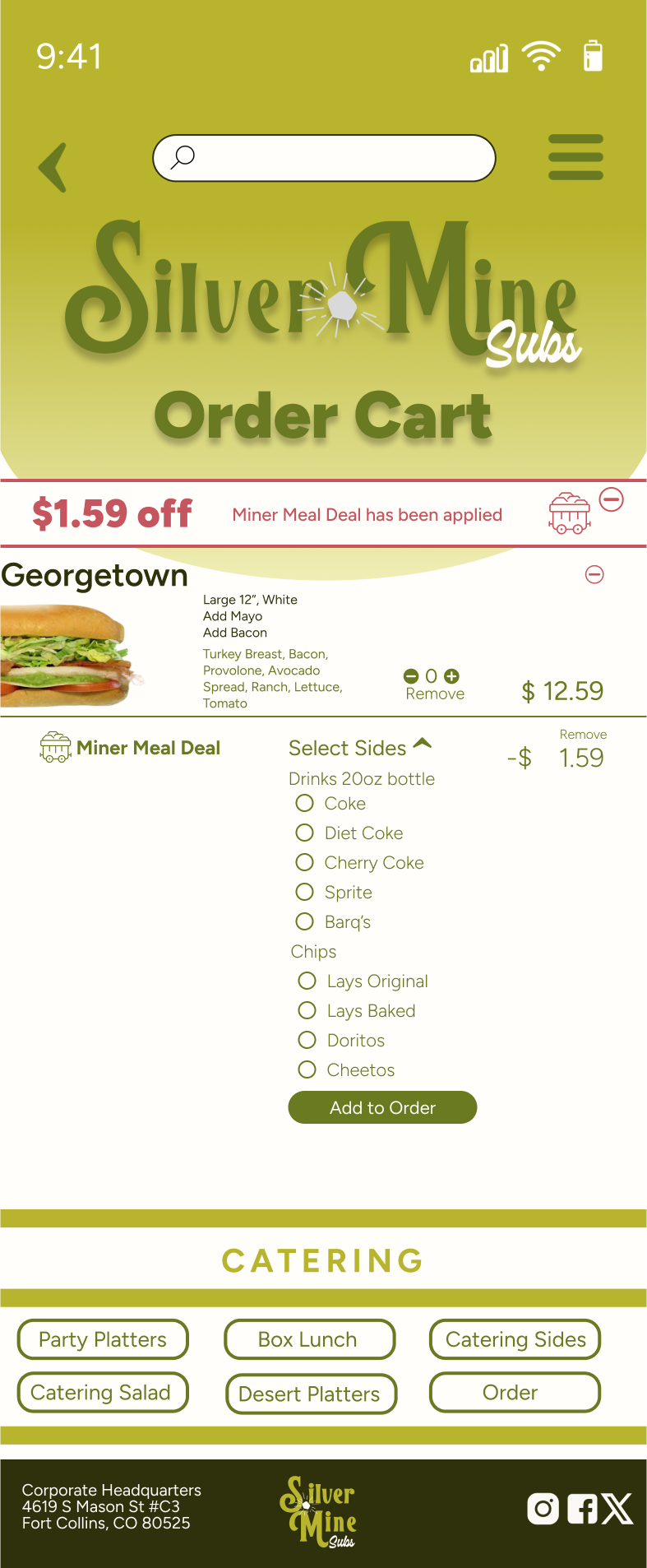
Simplified Menu Access


ORIGINAL:
Multiple steps to find specific sandwiches
SOLUTION:
All menu items on a single page with category filters for efficiency

FINAL PROTOTYPE AND OUTCOME
GOAL
A modern, intuitive and user-friendly website that expands Silver Mine Subs' appeal to a younger audience
VISUALLY cohesive and mobile-friendly design
STREAMLINED ordering process with intuitive navigation
BRAND IDENTITY updated to match Colorado's adventurous spirit
MEETS Gen Z expectations for usability, aesthetics and accessibility


COLOR PALETTE
EXPANDED on the existing green by adding lighter and darker change
ADDED a rosy red from the Colorado sunset and the famous red rocks


KEY UX/UI DECISIONS Navigational Overhaul
LOGO UPDATE


UPDATED logo to wordmark for better readability
ITERATED on the design to retain original iconography
ADDED the "silver nugget" as a nod to the brand's past
LOCATION and DELIVERY
REDESIGN


CONSOLIDATED delivery info into an overlay to reduce page clutter
INTRODUCTION
